
Designing an inclusive in-flight meal discovery experience:
Reducing accessibility gaps for users with dietary restrictions.

Background
Airlines most commonly offer meals through flight attendants serving pre-determined or limited options, often with minimal opportunity for upselling or customization. This approach can be inefficient, leading to potential dissatisfaction and missed revenue opportunities. An interactive meal menu within the in-flight entertainment system allows for greater customization, pre-ordering, and upselling, improving both passenger experience and airline profitability.
Problem Statement
Passengers with dietary preferences struggle to efficiently discover suitable meal options within in-flight entertainment systems, leading to frustration, inefficiency, and missed personalization opportunities.
Solution
An interactive meal menu on inflight entertainment systems will enhance the passenger experience by allowing for more informed and personalized meal choices, leading to greater satisfaction and reduced service errors.
My Design Process

User Research
In order to identify passenger expectations, preferences, and pain points, I conducted preliminary surveys, interviews, and focus groups amongst 24 Safran employees who were familiar with our in-flight entertainment system.

What factors influence your meal choice?
Are there any frustrations or challenges you face when using an online ordering system?


The simplicity and convenience of the meal selection process significantly impacts the user experience
Nutritional information should be highlighted in the meal menu to cater to health-conscious travelers and those with dietary preferences
Visual design matters – the design should include high-quality images, clear text, and an intuitive layout
User Journey
I mapped a user journey to understand how an ideal RAVE OS passenger experiences meal selection, highlighting moments of friction, uncertainty, and decision fatigue. These insights directly informed design changes aimed at improving accessibility and confidence in meal choice.

Isabel Jones
Scenario: Wants a low-friction way to choose a meal that works for her diet.

Design Overview
Meal Menu Wizard
One of the main requests received during our user research was the desire for simplicity. I decided that this could be achieved through a ‘Meal Menu Wizard’. In particular, this simple step-by-step meal selection would occur during the start sequence of the in-flight entertainment system. This way, passengers and crew will be aware of the options, and even order straight away, from the beginning of the flight.


General Meal Menu
While the Meal Menu Wizard is an essential element to enhance the user experience of passengers, it is crucial to design for passengers that chose to order later in the flight. Although the general UX/UI is very similar, the meal menu widget within the in-flight entertainment system offers a more detailed and thorough experience.


Usability Test
Once the meal-ordering feature was finalized, I conducted a usability test through UserTesting with 40 participants. Because our earlier research revealed that dietary information was a major decision factor, this round focused on whether the design was clear, intuitive, and accessible for passengers with dietary requirements.
As the user research highlighted the importance of nutritional information and dietary preferences, the goal of this research was to discover whether this design was accessible for those with dietary requirements. Participants were asked to imagine that they were a vegetarian on a flight ordering a meal. They were asked to perform three tasks:
1. Filter through vegetarian options
2. Access nutritional information
3. Place an order
After completing the scenario, participants were asked follow-up questions about clarity, confidence, and overall ease of use.


Quantitative Analysis

I segmented participants into two groups: users with dietary restrictions and users without. I compared time-on-task across both groups to assess accessibility and task efficiency.
The results showed that users with dietary restrictions consistently took longer to complete tasks, as reflected in the box plot. This highlighted an accessibility gap in the interface.
Based on these insights, I redesigned the experience to reduce friction and improve discoverability for dietary-specific options.
Design Amendments
A core goal of the design was to better support users with dietary restrictions. Usability testing revealed that these users experienced greater difficulty completing tasks, highlighting an accessibility gap in the existing interface.
Previously, nutritional information was only accessible via a small information icon, which many participants overlooked.
To reduce friction, I introduced a secondary access point: users can now view nutritional information either through the information icon or by tapping the meal image. This change increases visibility, improves discoverability, and supports faster decision-making for users with specific dietary needs.

I re-ran usability testing with the updated design and compared performance across users with and without dietary restrictions. The results showed no meaningful difference in time-on-task between the two groups, indicating that the accessibility gap had been reduced.
Overall task completion time also decreased with the updated design, suggesting improved efficiency and usability across all users.

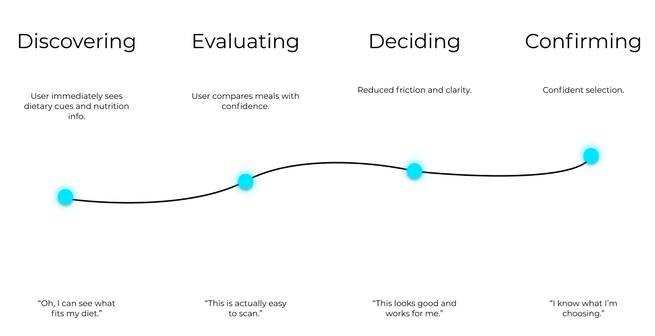
From Uncertainty to Confidence
I mapped a new user journey to show how the redesigned meal menu replaces uncertainty with clarity, enabling RAVE OS passengers to make confident choices with ease.
Thank You